
Design Concept


STUDY
PROPOSAL
PROCESS
-
Conducted market analysis to identify unique aspects of the In-N-Out brand.
-
Gathered insights through customer interviews and surveys to understand user needs.
-
Developed user personas and journeys to highlight user requirements and pain points.
-
Led brainstorming sessions using the Crazy 8 method to generate innovative ideas.
-
Structured the app’s information hierarchy based on user testing feedback.
-
Designed buttons, icons, and visuals to reinforce the In-N-Out brand identity.
-
Created a high-fidelity prototype in Figma to showcase app's full functionality ans style.
-
Presented the final app concept and detailed business proposition and business metrics.
CASE
Short introduction (read 2-3 min)
PROBLEM
BUSINESS
My Role: UX Researcher and Designer / Duaration: 8 weeks
The fast food industry is changing as consumer preferences evolve.
In-N-Out needs to adapt its business model to focus on digital solutions that meet customer needs. By doing this, In-N-Out can become a leader in the industry and ensure its long-term success.
-
IN-N-OUT does not have a mobile app for pre-ordering, leading to longer wait times and customers choosing to order from competitors.
-
Drive-thru locations lack visibility into busyness, causing frustration for their customers.
-
The dining experience is time-consuming and lacks convenience.
-
These limitations have resulted in negative consumer reviews and a loss in business revenue.
Key goal: Develop a mobile app.
-
Emphasize seamless and intuitive navigation.
-
Enhance the user experience by displaying location-specific wait times to show the busyness of each In-N-Out location.
-
Implement a profile account feature for users to store previous orders, payment information, and redeem rewards.
-
Allow users to customize their orders .
-
Include an order history and favorites section for easy reordering.
DESIGN
FINAL
PRODUCT
DESIGN
Addressing Pain Points
Locations
-
Customers can make informed decisions about when to visit the restaurant.
-
Avoid long waits during peak hours and choosing less busy drive-thru locations.
-
Manage expectations by having realistic waiting period information.
-
Customers can filter locations by entering zip code or by using tabs "Search Nearby" and "Open Now".

Addressing Pain Points
Ordering Menu
-
Direct ordering through the app for convenience.
-
Easy order customization to suit individual preferences from the menu.
-
Contactless transactions presented with multiple payment options.
-
User-friendly menu with icons and visulas for effortless browsing and selection.
-
Navigation bar increases app usability and allows accessing information fast.

Addressing Pain Points
Order History & Rewards
-
Intuitive design for managing personal data and account settings.
-
Exclusive rewards program that fosters customer loyalty and satisfaction.
-
Simplified process of reordering favorite menu items for a faster checkout, and reducing confusion and hassle.

Success Metrics
-
Task Success Rate: 85% of users successfully completed their tasks within a three-minute timeframe, which involved placing an order for pickup from their selected location and finalizing the checkout process.
-
User Satisfaction: 83% of users reported a positive experience regarding the design and functionality of the application.
-
Net Promoter Score (NPS): 100% of participants indicated a strong likelihood of recommending the product to others.
-
Conversion Rate: 90% of users completed the desired action by finishing the checkout process.
WANT TO LEARN
MORE?
You are invited to explore the comprehensive research, which includes in-depth process descriptions and supporting documentation.
The estimated reading time is approximately 20 min.
Why In-N-Out can no longer afford to skip out on having a business mobile app?
Mobile apps have become the cornerstone for entrepreneurs, serving as a vital tool for enhancing business operations and effectiveness. It is no longer a luxury, but a necessity that cannot be overlooked.
By embracing a business mobile app, In-N-Out can enhance their customer experience, streamline operations, and ultimately drive business growth.
- In 2018, 194 billion apps were downloaded, compared to 178.1 billion in 2017.
-
Total app usage increased by 50% between 2016 and 2018 globally, taking the total to approximately 1.35 trillion hours.
Project Specifications
Duration: 8 weeks
Tools:
Google Forms
Figma
Miro
After Effects
Photoshop
Illustrator
Maze
Lyssna
Throughout this 8-week project, I was following a structured design methodology. The goal was to maintain a systematic and user-centered approach. This methodology consisted of four key phases that played a crucial role in the success of this case study.
DISCOVER (Understanding User Needs)
DEFINE (Defining the Problem Statement)
DEVELOP (Creating Innovative Solutions)
DELIVER (Bringing Solutions to Life)
As a UX/UI Designer and Researcher, my main responsibilities included assigning roles to each member of our group, setting deadlines for assignments and group validation, establishing a clear hierarchy and project goals, and organizing our daily meetings and weekly retrospectives. I also took the lead in conducting research and designing part the project.
My Role
DISCOVER
In the Discover phase, my primary objective was to conduct a comprehensive exploration. Through extensive research and analysis, I aimed to uncover valuable insights into the desires, preferences, and challenges faced by IN-N-OUT target audience. This in-depth understanding formed the foundation for the next phases of my project.
Initial Research to Identify the Problem
In order to identify the problem I began with the assumptions mapping:
1. Used sticky notes for all problems In-N-Out customers potentially experience.
2. Narrowed down our assumptions by those we are Certain - Important and Uncertain - Important.
3. Created the value proposition canvas because I wanted to better understand the needs and wants of the target customers.
Assumptions
Pain Points: Certain - Important
-
Long wait times at drive thru
-
No access to food order history
-
Mobile pick-up locations
-
Poor design of the existing app

Value Proposition
To precisely tailor our design solutions and address customer needs effectively. This exercise aimed to uncover the unique value we could offer to customers, ensuring the design decisions align with In-N-Out's brand identity and resonate with its customer base.
Values
-
Intuitive and clean design
-
Loyalty program and rewards
-
On-the-go ordering process
-
Updates on wait times

Takeaways
-
Prioritize Ideation: Focus on the ideation phase to inform the design process.
-
Translate Needs: Convert customer desires into actionable features.
-
Collaborative Understanding: Avoid assumptions; work together to identify needs.
-
User Research: Validate proposals through research to ensure user value.
-
Define Target Audience: Start with a persona to guide development.
-
Scope Boundaries: Limit scope based on the persona, like considering kids' menus for parents.
-
Customer-Centric Focus: Keep the customer’s perspective central to the value proposition.
Competitive Analysis
I conducted a competitive analysis of six restaurant apps, including In-N-Out, to evaluate their ordering interfaces, locations, accessibility of nutritional information, and dietary preference displays. This evaluation provided valuable insights into the strengths and weaknesses of each app, sparking our creative brainstorming process and identifying areas for improvement in our competitors' design decisions. This analysis has also revealed opportunities for us to succeed.

Orering Pages
explored creative approaches to simplify and enhance the menu ordering process.
Location Pages
studied how competitors effectively shared wait times or business operating hours on location pages.
Order History & Rewards
investigated how competitors incorporated order history & reward systems into design.
DEFINE

How can we revolutionize the In-N-Out ordering process with a mobile app that aligns with the brand's values and enhances the customer experience?
96% of Americans own a cellphone, while the average person checks their phone 144 times a day, spending 4 hours and 25 minutes engaged with their devices.
These staggering statistics highlight the undeniable influence of mobile technology in our lives. By not having an app, In-N-Out is missing out on a direct avenue to connect with customers and cater to their digital preferences.


To gain insight into user behavior, I conducted a survey with 15 individuals to explore their present preferences and interactions with online and mobile applications for ordering purposes.
FOUND OUT ABOUT OUR USERS
• Menu - Users want to view a full menu, have visual representations of their food, filter options for their food, and some users expressed interested in seeing information related to their dietary preferences.
• Ordering - Users want to be able to order ahead and be able to select their pickup method.
• Reward and account - Users want to be able to have reward features and create an account.
• New opportunities - Users want to be able to order before they get through the drive-through lane and see the restaurant's busyness ahead of time.

Creating USER PERSONAS was an essential step in my design thinking process, because they provided insights into target users beyond basic demographics. I was able to understand users' needs, experiences, behaviors, goals and pain points. Personas promote empathy by allowing us to focus on individuals rather than groups.

IN ORDER TO
To fully grasp our users' pain points and better serve their needs, we created a customer journey map, which provided valuable insights into the user's perspective, helping us identify key moments that impact their experience. We pinpointed pain points and opportunities for improvement, guiding our design decisions.

Pain Points
-
Absence of a fully functional mobile application.
-
Inability to conveniently pre-order food.
-
Lack of estimated wait times.
-
Limited options to customize orders.
-
Difficulty accessing crucial allergen information.
-
Longer wait times for customers.
-
Dilemma of choosing between drive-thru and in-person ordering.
-
Inefficiency in curbside pickup service.
-
Longer wait times compared to competitors.
BASED ON
our initial research:
-
Our proposal aims to create a mobile app for In-N-Out that offers customers an easy and efficient way to order meals.
-
Our main objective is to design a user-friendly app with a smooth ordering process to enhance the customer experience.
-
Additionally, we plan to include an account page where users can save their previous orders and payment information for future transactions.
-
Providing real-time updates on In-N-Out locations can help customers make informed decisions.
-
By implementing these features, we aim to improve customer satisfaction and loyalty to the In-N-Out brand.
Develop
I aim to develop a mobile app for In-N-Out that lets customers easily order online. Extensive research indicates a growing demand for convenient mobile ordering.
By incorporating this feature into In-N-Out app, I seek to accommodate customer preferences and provide a smooth and hassle-free ordering experience accessible from anywhere, anytime.
.png)
CRAZY 8 Sketches - Ideation 1
The Objective: The app will have an intuitive navigation with an easy and efficient order placement process and real-time updates on wait times at drive-thru locations.
Utilizing the UX methodology of dot voting, we were able to see which features and interface elements we wanted to move forward with and those that needed to be altered or abandoned.

Ideation Takeaways

-
Locations Screens: Show busy times and wait times at In-N-Out locations to help customers plan their visits.
-
Curbside Pick-up: Order through the app and conveniently pick up meals from vehicles.
-
Easy Ordering for Favorite Combos: User-friendly process to order favorite In-N-Out combos with customization options.
CRAZY 8 Sketches - Ideation 2
The Objective: Users will create an account and save their previous order information, payment information, etc.

Ideation Takeaways
In conclusion, by implementing the functionality for users to create accounts and save their previous order information, payment details, and other preferences, we are providing a valuable feature that enhances convenience and personalization within the app.
-
Users can create accounts to save order and payment information for a personalized experience.
-
A dedicated page allows easy access to review past orders, improving convenience and accuracy.
-
The user profile section offers filtering options for allergens or dietary needs, enabling customized choices.
-
Close collaboration with In-N-Out's website ensures smooth integration with existing systems.
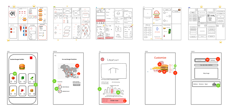
Prototyping
As a UX/UI designer I was assigned to develop the Location Screens (Discover & Navigate) for In-N-Out. These screens were the most important for out project. The extended waiting times at In-N-Out locations, whether at the drive-thru or on-site, resulted in frustration and a lack of motivation among customers to visit the restaurant. To address this issue, I undertook the creation of several mid-fi and hi-fi prototypes. Through extensive testing using Maze and Lyssna, I was able to enhance the initial design concepts and improve usability, including optimizing the information hierarchy.

Hypotheses
Users will be able to navigate through the app to locate their desired restaurant location.
Participants
A diverse group of individuals who encompass both current patrons of In-N-Out and potential customers.
Methodology
Participants will be tested using mid/ hi - fidelity prototypes from Figma on the Maze and Lyssna platforms.
Methodology Screening Questions
Participants will not undergo any form of screening as the aim is to gather a diverse group of respondents with a wide range of experiences.
Tasks (Administered via Maze) :
You'd like to pick up from: 7009 Sunset Blvd., Hollywood, CA 90028. Please show us how you would select your location.
Documentation from the research and usability testing
Results
Task: You'd like to pick up from: 7009 Sunset Blvd., Hollywood, CA 90028. Please show us how you would select your location.
-
86.7% success for both screens;
-
33% miss-click rate (for home screen);
Users felt:
-
mostly easy to use;
-
purpose of map screen?
-
like the “open now” feature;
-
have to scroll to see “pick up/drive through” options created confusion.

Screens to consider reworking or that caused confusion

Post - Study Questions
Considering the app you have just used, select the words that best describe your experience with it.
You can choose as many words as you wish:

Takeaways
-
Make pick up/ drive thru options visible on home page so users do not need to scroll.
-
Rearrange icons (User's Profile and Order History).
-
Consider adding navigation bar to concisely include all menu/icons.
-
Relocate the “sync” button on location screens.
-
Consider having a digital map for visualization on location pages.
-
Rather than filtering the locations by "Close By “ Open Now" & "All” - consider filtering by "Near Me" and "Open Now".
After having multiple prototype testing we gathered the data and applied the following decisions to our prototype:
-
Adding intuitive buttons, icons, and a navigation bar for an easy navigation.
-
Provide clear messages and visual cues.
-
Clear navigation.
-
Easy ordering process.
-
Include essential information.


Discover & Navigate Screens
Values
Our approach focuses on providing essential information, such as address, operating hours, directions, and real-time updates on wait times and foot traffic. With a minimalist design, we offer convenience to customers, enabling them to make informed decisions and optimize their time by avoiding long waits during peak hours and choosing less busy locations. Customers can manage their expectations effectively.
Addressing Pain Points
-
Customers can make informed decisions about when to visit the restaurant
-
Avoid long waits during peak hours and choosing less busy locations
-
Manage expectations by providing realistic waiting period information
-
Customers can optimize their time by choosing less busy locations
-
Help customers to filter locations by "Near Me" & "Open Now"
DELIVER
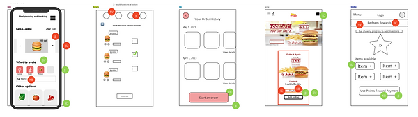
Bringing Solutions to Digital Life
Step by step demo for ordering a Pick-Up from the nearest location
LogIn / SignUp
Loading Animation
Home Page
Loading Locations

Syncing or typing in an address
Locations with filters
Ordering food

Demo for going to a Drive Thru location with the shortest wait time


Conclusion
When evaluating any given solution, it is crucial to take into account the advantages and disadvantages of the proposed approach. By doing so, we can gain a holistic perspective on its merits and identify potential avenues for enhancement.
Let’s Discuss what needs to be done better
-
Initial Capital Investment: The development and upkeep of the application necessitate an initial financial investment.
-
Maintenance and Updates: Ongoing maintenance and regular updates are necessary to address evolving user needs.
-
Design Refinements: Improve the overall App design by implementing the latest UI trends. Improving the contrast of the Call-to-Action button (red with white text) to enhance visibility and user engagement. Conduct further testing on the “Sync” icon on the locations screen to ensure clarity in its usage.
Here is what has been accomplished
-
Implementing Wait Times: Users can access real-time information, allowing for better planning and decision-making.
-
Ordering Process: Our solution offers a more efficient and user-friendly experience, reducing customer wait times.
-
Competitive Edge: Implementing an app with online ordering functionality positions us with competitors, attracting new customers and retaining existing ones.
-
Improved Customer Engagement: The app enables promotions and rewards, fostering a stronger connection with OUR customers.

-
Initial Investment
-
Maintenance and Updates
-
Design Refinements and Additional Testing

-
Real-Time Updates
-
Streamlined Ordering Process
-
Competitive Edge
-
Improved Customer Engagement
Final Design Updates


Analysis of Success Metrics
By evaluating the metrics that influence user satisfaction and align with business objectives, we can effectively demonstrate how our designs contribute to the project's overall success.
-
Task Success Rate: 80% of users successfully completed their tasks within a three-minute timeframe, which involved placing an order for pickup from their selected location and finalizing the checkout process.
-
User Satisfaction: 80% of users reported a positive experience regarding the design and functionality of the application.
-
Net Promoter Score (NPS): 100% of participants indicated a strong likelihood of recommending the product to others.
-
Conversion Rate: 90% of users completed the desired action by finishing the checkout process.