
resurfacing
Headspace
Simplify the onboarding process by creating a step-by-step guide for new users. Minimize cognitive overload and optimize user journey. Empathize with the user’s frustrations and challenges to create a seamless and positive experience.

RESEARCH
DESIGN CHALLENGE
in what way can Headspace incorporate a better navigation solution for choosing a subscription plan in the onboarding process to enhance user engagement and trust?
GOAL
to introduce a refined system that enhances usability, optimizes performance, and elevates overall user satisfaction and brings new customers.
USER JOURNEY MAP
I created a User Journey Map to better understand why users may not want to proceed with Headspace app and what frustrates them during onboarding.

PAIN POINTS
-
overwhelming cognitive load;
-
excessive screens and unnecessary tabs;
-
mandatory subscription prior to accessing
a free trial.
I conducted user surveys to get
the inside information about general frustrations users face
in the onboarding process and when subscribing to the app.


Based on the feedback received from the surveys, it was evident that the most prevalent general feedback among Headspace users was their desire for a more streamlined onboarding experience. Specifically, users expressed a preference for a shorter process with fewer screens and the ability to immediately begin their trial.
HOW MIGHT WE
-
HMW redesign the app onboarding process to ensure a user-friendly experience that doesn't overwhelm users with numerous steps?
-
HMW incorporate subscription and trial options for first-time users to pique their curiosity and encourage them to delve deeper into the app?
-
HMW we generate instant interest and enable swift customization for users during the onboarding phase?
-
HMW establish trust by offering users the simplest approach to managing their subscription plans?
-
HMW enhance the logic in onboarding navigation to guarantee a smooth transition to the app's key features, making it effortless for users to explore and navigate through the app?
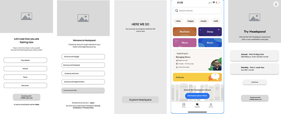
HOW HEADSPACE’S
ONBOARDING PROCESS
LOOKS LIKE NOW:

What if our user has an Android?
Identify user’s attributes and customize the onboarding to reduce cognitive load.

Is the 3rd screen really necessary?
Each extra screen during the onboarding process results in a further decrease in user engagement. To minimize drop-offs and prevent early fatigue, it's crucial to keep the number of screens and taps to a minimum.

Asking for payment already?
Our users haven't even had a chance to experience anything in Headspace, and it's already prompting them to pay! How can we expect our users to make a payment before they have even taken a single session?

Finally!
After 9–10 taps on the screen, our user was able to start a first session.


IDEATION
MY APPROACH
-
Offer social login options to simplify sign-up.
-
Customize onboarding to reduce cognitive load.
-
Personalize the experience for users' intent.
-
Provide some immediate value before asking for payment.
-
Implement A/B testing with two different onboarding flows to let user data decide.

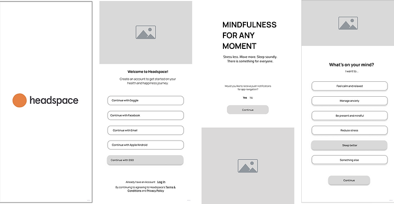
LO-FI WIREFRAMES FOR
FLOW A
Asking if a user likes to receive tip messages while using the app.
Pop-up tip message that helps a user understand
the task


LO-FI WIREFRAMES FOR
FLOW B

TESTING


After conducting 3 comprehensive interviews, it was discovered that:
-
all three participants favored Flow A as the preferred onboarding method.
-
In order to enhance user experience, it is recommended to eliminate the initial screen that directs users to the Homepage of the app.
-
Instead, a more effective approach would be to utilize a pop-up message, indicating that users are now prepared to explore the app's content.
-
Additionally, incorporating tip-notifications after the onboarding process can prove beneficial, as they would guide users on what actions to take and where to begin.
UPDATED LO-FI WIREFRAMES FOR
TESTED FLOW A

Hi-Fi
PROTOTYPE
wireframes


C O N C L U S I O N
After conducting additional in-depth interviews and
testing, it was found that 4 out of 5 participants
preferred the enhanced A version over the existing one.
Areas for further improvement
1. Enhanced testing:
Conduct additional tests to ensure the app functions flawlessly and address any potential issues, providing a seamless user experience.
2. Tip-notification system:
Implement a feature that notifies users about common problems they encounter, allowing us to offer timely support and improve user satisfaction.
3. Streamlined layout with a library:
Improve the app's organization by incorporating a library section where users can access helpful resources and video guides, making it easier for them to navigate and utilize the app's features effectivey.